This essay is a critical reflection on how my team used genre conventions, representations, and technical elements to create a clear brand identity and connect with our audience.
For my team’s Component 3, we chose the music promotion package. We chose to do Karma Police by Pierce The Veil (2023) which is part of the alt-rock genre. Our fictional band, BLAST, was created to appeal to our target audience of teenagers to young Indonesian adults (15-25) through a youthful, rebellious, and genuine persona.
Branding is the overall image or feeling an artist puts out to the public, making them recognizable to their target audience. Branding could be things like an artist’s aesthetic, attitude, or humour. This is supported by the Theory of Stardom by Richard Dyer, stating that celebrities are carefully created by media industries through promotions, interviews, or public stories in order to attract audiences and make them seem relatable.
Our MV, Social Media, and Digipak share a visual style through a dark colour grading and intentionally low quality production. In the MV, the dim lighting, grainy footage, and greenish tint were implemented purposely to make the performance as raw and as natural as possible.
On our Social Media (Instagram), the photos from the digital camera and casual posts follow the same muted colours and butchered quality (with some posts using the same greenish tint) to make the content feel more personal. We tried to emphasize this personal connection the band has with their audience by showing the members’ media literacy in how they communicate online. One of the band members, Scarlett Maxwell, showed excellent media literacy skills by managing the band’s Instagram account and using everyday online language or emojis when talking to their audience, making the interaction seem more direct. At the same time, this also highlights their “Gen Z” identity, as teenagers who are used to communicating casually online.
The Digipak also follows the same dark style but uses grey and muted blue tones instead of green. The reason why it’s the odd one out is because we wanted to completely separate the reality of the band with the concept of their MV (which involves politics and the idea of corruption). The use of cooler grey and blue hues hints at the lighting of CCTV or police environments. We meant to make it feel more controlled and official, showing the results behind the issue (corruption) instead of just emotion. Because of this, the Digipak feels more weighty and intense (the complete opposite of the band’s personality) representing the result or consequences of the events happening in the MV (execution, corruption, etc).
All of this supports the band’s persona and values because the low quality visuals are meant to represent the band as teenage amateurs who are still figuring things out, not professional stars. The silly and unserious posts show that they are a friend group enjoying music together, caring more about looking fun rather than skillful. On the other hand, the darker, gloomier concepts of the MV and Digipak show they also take their music seriously and want their message to be heard. The duality of the band hints that they wish to be famous one day, but are still genuine and down to earth teenagers at the end of the day.
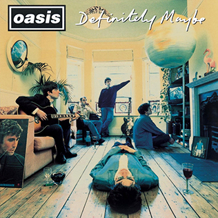
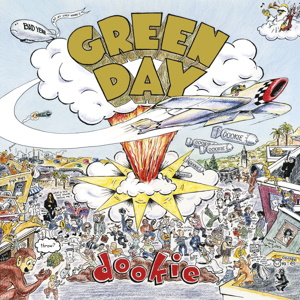
Our research into alt-rock bands helped guide the decisions we made in both the MV and the Digipak. Most bands in this genre use low lighting, muted tones, and slightly faded colours, which might make it monotone and boring to people who are not part of our subculture. However, these bands do it purposely to create a raw and real feeling, avoiding a polished image. Personally, I focused on albums like “Definitely Maybe” by Oasis and “Dookie” by Green Day, which ended up being our biggest inspirations that made us settle with our band’s personal and rebellious persona. “Definitely Maybe” uses soft and warm colours followed by natural lighting, which makes the band feel casual and down to earth. On the other hand, “Dookie” uses messy colours that feel chaotic and playful, representing enthusiasm and rebellion. Combining these two provides the perfect definition of our band’s branding and personality. These two were the main reasons why we decided to embrace our authenticity and silliness instead of trying to look professional.
We can link this to Steve Neale’s theory, where he states that genres rely on repetition and difference. In our case, we repeated familiar visual conventions to hint at the genre, but added our own youthful and carefree personality to make the band feel unique and less generic.
Our MV and Digipak both use visuals to portray the tragic themes, but in different ways. The MV highlights corruption and the darker side of politics through its carefully curated mise-en-scene. Our editor chose to use green tint and low saturation, making the characters look pale and unhealthy, implying moral decay. We applied exaggerated, shaky camera movements to add instability, which represents the corrupt government. In our MV, our singer (Raymond Dubois) pushes the camera until it falls during the lyric “This is what you get, when you mess with us”, making it feel immersive to the audience and showing rebellion against authority. During the same scene, close up shots were used to underline his tense expressions, the close proximity making it uncomfortable to the audience.
Unlike our MV, our Digipak uses muted grey and blue tones. As I’ve already explained above, these colours are more heavily associated with CCTV footage and police environments. To further accentuate that, we used a chalk style font, which looks similar to police sketches (links to oppression). The back side of our Digipak was handwritten using actual chalk, evident in how rough it looks (suggesting rebellion, subversion to commercial expectations).
Our Social Media targets teenagers to young adults who like alt-rock and are considered pretty active in online communities. Our Instagram may appeal to them through a consistent colour scheme, that being grey, black, or white tones with very few bright colours. To support this angsty aesthetic, we carefully chose to appear in grunge and punk style clothing in our posts (chunky belt, beanie, black attire, etc). Our promotional posts (MV teaser, album cover reveal, and gig poster) act as hermeneutic codes as they only hint at the audience instead of giving them full spoilers, making them curious about what’s coming. On the other hand, our personal posts (BTS clips, childhood photos, etc) represent humour and personality, making the band seem reachable to their audience.
Engagement is created through frequent replies in comment sections and a public Discord server. Both of these include the use of modern, “Gen Z” language by both the account manager (Scarlett Maxwell) and the fans, through words like “LOL” (laughing out loud) or “OMG” (oh my God). This direct communication makes the band feel friendly, unlike well-known bands who feel distant because they are too busy to respond to comments or replies.
Our page covers Uses and Gratifications in several ways. Personal identity occurs as fans are basically growing with a band that is also still figuring themselves out. As the band evolves to settle with their own identities, audiences are welcome to see them as role models and inspirational figures. Additionally, diversion comes from interactive, entertaining posts and music that provide escape from reality. To some people, especially youths (such as the band members and fans themselves), making and listening to music is a good way to settle down and relax. Social relationships develop through Discord conversations where fans meet each other. This links to McLuhan’s Global Village theory, as the server allows fans from around Indonesia to connect with each other and share the same passion as a whole community, despite their distance.
Through the Theory of Stardom (Richard Dyer), the band is appealing to their audience because they underline their amateur side instead of looking polished, making them relatable. Through the Theory of Fandom (Henry Jenkins), fans show enunciative productivity through shared inside jokes (common in communities consisting of teenagers) and textual productivity through possible memes and funny edits. This turns the audience into an active community, not a passive one.
Our products represent Indonesians living in a society heavily affected by corruption and abuse of power. The dominant reading we want to reach our audience is that corruption is harmful and illegal. The camera often uses close ups and handheld, shaky movements to make characters look uncomfortable and unstable. For our mise-en-scene, other than dim lighting or shadows, we also highlighted restriction and pressure when covering the journalist and corrupter’s heads with cloth right before their execution. The song itself is a sound of seriousness, supported by tense performance and aggressive movements from the band.
The band is presented as a thoughtful group of teenagers who care about real issues. We avoided stereotypes like careless youths to show that they are passionate and concerned, not childish. We’d like to emphasize the idea that young people are also capable of acknowledging social problems, not just ignoring them.


