This blog post contains research on a bunch of typefaces and title ideas for our movie opening scene project. This blog post was done by my team member, Kristine, however I slightly changed her words into my own.
Examples I liked₊˚ʚ ᗢ₊˚✧ ゚
1. [⏺REC]
I liked this idea because the font and style of the text looks slightly different from other found footage titles, making it unique and special. The red dot and bracket basically gives the reader an impression that the movie is like a recording, so the audience knows it is a found footage film. In the second version, the blood splatters gives the audience an idea that the movie is going to involve sensitive topics such as murder, death, or gore. However, this title card was shown at the end because the filmmaker wanted to keep it realistic while still adding the title.
2. The Blair Witch Project
The opening scene was very short because the title card appeared before the movie started. In found footage films, an opening scene is not always necessary in order to keep it realistic. I like how the title was really simple (like a normal text) but it had strong reasons behind it. Using a small title makes the audience feel like they are watching raw, unedited footage, which helps keep the film immersive.
3. Grave Encounters
In my opinion, this was a clever way to add a title card because it didn’t really feel like one. What's particularly good about it is its font, because it stands out from other found footage movies. This is due to its distorted look, which gives off an uneasy feeling, such as paranoia or hallucination.
4. Cloverfield
This title card is really interesting because they purposely made it look like it came straight out of a camera (the timestamp and font). We could use this as an inspiration to help make our film feel more realistic. I like how the editor used different tech-style fonts to give the reader an impression that they're watching a video recording from a camera.
5. Spree
This is actually similar to Grave Encounters, where the title card was hidden in the scene to keep it realistic. I think this opening scene is really cool and smooth because of how the transition was done (the app's name that was featured in the movie is also the movie's title). This serves as an inspiration to us because we could use the book’s title as our title card. I also like the simple, clean font with a red title, which gives off an eerie feeling, as the color red symbolizes danger.
Credit/names˖ . ݁✶⋆.˚
Starring:
1. Drew: Panji Wiradharma
2. Carrie: Kellie Collins
3. Lyla: Lamiya Zara
Editor:
1. Maisie Halomoan
Director:
1. Kristine Lambert
Why we might NOT add credits:
In a lot of cases, found footage films don't usually have opening credits in order to keep them realistic. Since we wanted the same style, we decided not to include any credits at the start. Adding them would break the immersive feeling towards the audience and make it feel less realistic.
10 typeface choices˚ ❀˚ ༘♡
Discussing connotations✿⋆𓆉︎⚘°
1. VCR
The picture above is an example of how it'll look like if put in our project. I like this font because it's basically the font that a lot of found footage movies use, hence it is very commonly seen. It keeps the found footage style authentic. However, what I don't like about this font is how the font looks too old for a modern found footage film, so it doesn’t match the 2019 setting that we decided on. On its own, the font looks weird and might need vintage filters to make it feel more realistic. Without them, it could break the film’s uniqueness as a found footage.
2. Punktype
The picture above is how it'll look like if added into our video. The font looks glitchy and spooky, like a broken or haunted message. This makes it great for horror because it creates a feeling of fear and mystery. What I like about this font is that it looks handwritten, which is common in found footage horror. It makes it feel like it was really "found," making the movie more realistic. What I don’t like is that it looks too old for a modern setting like 2019. It doesn’t match the time and might look strange without vintage filters. The title card makes the movie feel real, like a police report or warning before something scary happens. Since it has no pictures or fancy effects, it looks unedited, like a real tape someone found. This makes the horror feel even more real and creepy.
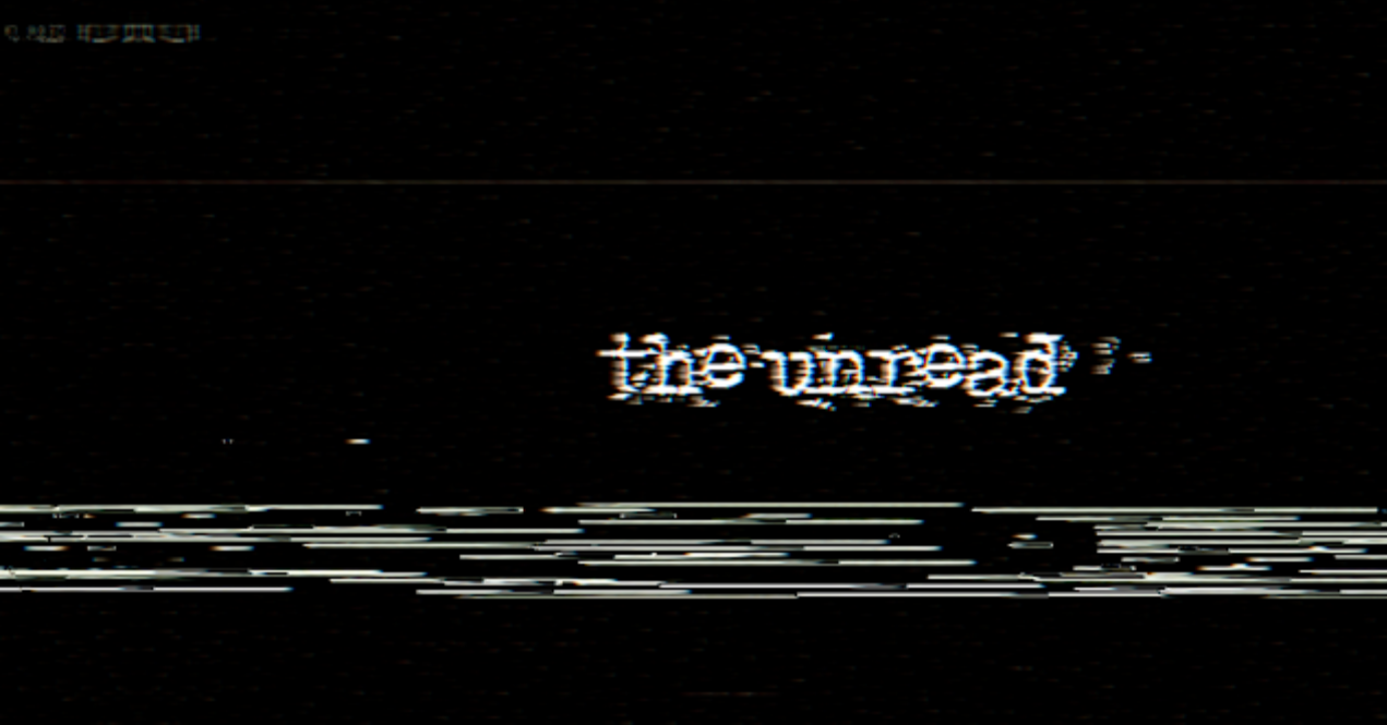
Experiment☾𖤓
Title ideas
Opening text ideas
Reflectionʚɞ˚
Making this blog was really simple because I only had to add a little info to Kristine's work. This was an easy task because found footage doesn't really require much fonts and effects because that would destroy the illusion of realism. But this was challenging because not much found footage films have title cards or opening scenes. Luckily, as media evolved, more found footage films have been subverting this convention. Finding and choosing the fonts was easy for me because there was a feature in the dafont web where they had specific fonts for horror / typewriter.


No comments:
Post a Comment