Software used⋆.˚⭒⋆.˚
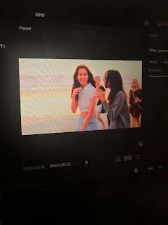
To begin with, I chose capcut to edit our first ever media project because it is one of the most easiest editing software for beginners like me. Although it is surprisingly effortless to use, it still has all of the features you might need for your own personal project, such as tools for cutting, adding effects, text and music, which I love. Another reason why I chose capcut was also because I was already familiar with how it works, hence it saved me a lot of time from learning a completely new editing app.
Colour grading ✩ˊ˗
This was how my clips looked like before adding color to them:
This is how my clips look like after adding colour (Clear II on Capcut):
Although subtle, I love how the colors look brighter and slightly more saturated. To the nature, it makes it look more eye catching because the effect brings out the color within them. As for the people in the clip above, it made them (me, kris and the tourists) look livelier. With our skin looking brighter, it looks like we are less pale, and this gives off an impression that we are energetic teenagers having a good time at the beach together.
Intensity
Everyone's skin tone looks overly orange and bright, and this did not look natural at all, which I didn't like.
Audio── ⟡˙ ̟
Main song
In the picture above, we can see that all three parts were faded in, meaning that they all started off in a slightly lower volume then gradually increases. In these three parts, they all have different volumes, starting from low, medium to full, building up as the video continues. This is what Mr. Nick suggested me to do.
Our main song was extracted from a video recording I took from Spotify.
Sound effects
#1
There are around 4 scenes like this, and my original idea was to add a typewriter sound effect, like when typing on a keyboard. At first, I thought it was a good idea until I asked Mr. Nick to review my on going edit. He told me that it didn't match the vibes our group was going for.
The typing sounds made it sound old fashioned, like when older people typed on a type writer back in the day, while our ad shows teenagers living in the modern generation. I realized his point was true and started thinking on which sound effects would suit it better, or if I even should be adding one.
Mr. Nick then suggested me to add little bits from our main music instead, creating the loud-silence effect when the clips take turns playing back and forth.
#2
Another sound effect I added was during the scene where Kris picked up her ringing phone.
Second, I added a voice changer called "Vinyl" that made Michelle's voice sound slightly robot-y. I did this to literally make it sound like she's on the other side of the phone call, to make the phone call sound more real.
#3
The last sound effects that I added was when every scene that relates to taking pictures comes up. In our tourism ad, we have two:
The scene where all four girls were taking a selfie at Slushy Society.
The scene where all four girls were taking pictures in the photo booth.
Why
The reasons why I added these sound effects was to make the situation seem more lively and real. Just like when you take pictures from cameras or your phone in real life, you would usually hear sounds like "snap!" or "click!" when your phone isn't on silent mode.
The sound effect I used was generated straight from Capcut, called "camera shutter".
Transitionsᶻ 𝗓 𐰁✰
In this section, I will be explaining the important transitions that I added and the meaning I was trying to convey with them
#1
In this video, it shows that I used the transition "page turning" to show the change in locations. The reason why I chose this transition was because I wanted to convey a deeper meaning to the audience, which was they were about to discover a new story. Just like when we read books, every page tells different stories, right?
Hence, I chose this transition to connote to the audience that they were about to unravel more things about Bali in a different location, and all they had to do was the turn the page to discover more.
#2
In this video, it shows that I used a transition called "circle" to show the change in locations. The reason why I chose this transition was because I liked how it makes it look like the audience is looking at the video through a microscope.
As well all know, most microscopes' lenses are circular, and they are used to see important details. I wanted to imply that the "Slushy Society" sign was important and that the audience should look at how bright and vibrant the sign looks. I also wanted to connote that the location has moved from Playroom to Slushy Society, hence the use of the "circular" transition that almost looks like a microscope lense supports the fact that the change in location is crucial to be realized by the audience.
#3
In this video, I used a transition called "dots right" to show the change in locations. The reason why I chose this transition was because it fits the yellow lights on the big "Love Anchor" sign. By doing this, I was trying to hint to the audience that the next location would have something to do with bright yellow lights,
As you can see in my video, Love Anchor is filled with bright yellow lights all over, especially their big bright sign. So, using the "dots right" transition as an opening to the Love Anchor scenes, it acts like some kind of teaser to the yellow lights.
#4
This is the last major transition that I used to show the change in locations. This time, I used a transition called "blink". It's pretty self explanatory. It shows that the camera acts as if it's from the viewers' point of view. When it blinks, it shows that the location has changed.
I chose this specific transition because I wanted to convey a deeper meaning. The meaning that I wanted to express to the audience was that when you're having a lot of fun in Bali, a single blink can get you so far. There's a belief where people say, "Time flies when you're having fun". That is the kind of message I tried to put out to the audience. Even when you feel like you've only blinked once, you'll lose track of time due to the overflowing excitement you're experiencing.
Animation✧・゚: *✧・゚:*
#1 Text
In this clip, it is shown that the text appeared smoothly using the animation "wobble". I chose this animation because it gives a gentle feeling to it, which matches the soft beat (before the beat gradually increases throughout the video).
Additionally, the background shows the water, which is known for its wobbly movements. This matches the animation used in the text, as if it's resembling the water currents.
Previously + changes made
Before using "wobble" my first option was "typewriter". Like I mentioned somewhere above, Mr. Nick didn't like the idea because it didn't fit the scene on the background.
#1.1 Call to action
On top of that, it is also the only word colored in red. The color red means warning and strength, and by using the color red in the word "Don't", it gives off the same effect as the animation I explained above.
For the other two words, "miss" and "out!", I did not add any coloring or animation because I wanted to convey that those two words are weaker than the word "Don't". They are kept simple to show that the dominance belongs to "Don't".
In conclusion, this is how our call to action turned out in the end:
Reaction to my editing (final video).𖥔 ݁ ˖꩜
This is a google drive link to a video of my mom and sister reacting to my final video. Apologies for my mom's awkwardness: https://drive.google.com/file/d/1RabFQhpEZG9l2dsMe7h5NH_h1msFLUeW/view?usp=share_link
Self-reflection*ੈ✩‧₊˚
I felt so relieved after completing this blog. I know I say this in almost all of my self reflections, but this blog was so tedious and time consuming. To make this blog, I had to finish my editing first so that I can accurately mention and explain everything in detail. Since exporting took a long time, my process on this blog was also delayed.
However, I love how this blog turned out. It looks so neat, and I'm very proud of myself for explaining all of the important details very clearly. Even though it is now currently 3:42 am, I think the effort and hard work was worth it. My back really hurts.
In conclusion, looking at the finished blog makes me happy because I realized how I did all of the editing myself. Reflecting on the process step by step helps me appreciate my work even more. Next time, I will definitely be more organized by adhering to my editing schedule consistently.


No comments:
Post a Comment