In my opinion, this was a clever way to add a title card because it didn’t really feel like one. What's particularly good about it is its font, because it stands out from other found footage movies. This is due to its distorted look, which gives off an uneasy feeling, such as paranoia or hallucination.

This title card is really interesting because they purposely made it look like it came straight out of a camera (the timestamp and font). We could use this as an inspiration to help make our film feel more realistic. I like how the editor used different tech-style fonts to give the reader an impression that they're watching a video recording from a camera.

This is actually similar to Grave Encounters, where the title card was hidden in the scene to keep it realistic. I think this opening scene is really cool and smooth because of how the transition was done (the app's name that was featured in the movie is also the movie's title). This serves as an inspiration to us because we could use the book’s title as our title card. I also like the simple, clean font with a red title, which gives off an eerie feeling, as the color red symbolizes danger.


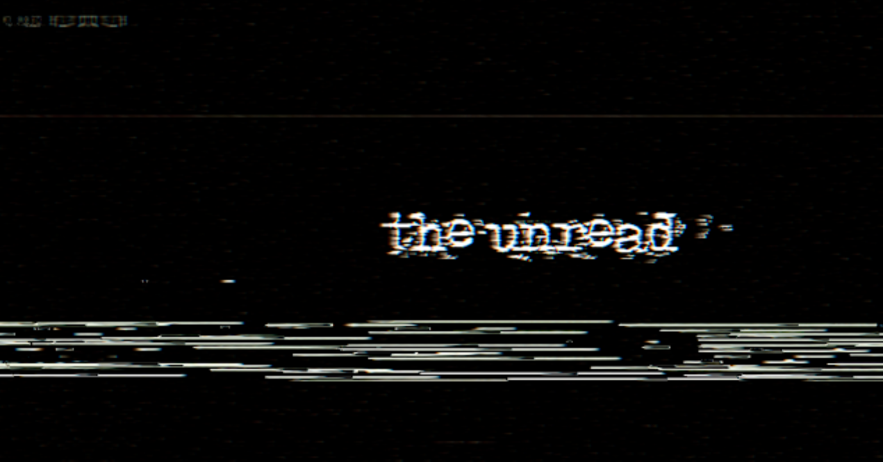
The picture above is how it'll look like if added into our video. The font looks glitchy and spooky, like a broken or haunted message. This makes it great for horror because it creates a feeling of fear and mystery. What I like about this font is that it looks handwritten, which is common in found footage horror. It makes it feel like it was really "found," making the movie more realistic. What I don’t like is that it looks too old for a modern setting like 2019. It doesn’t match the time and might look strange without vintage filters. The title card makes the movie feel real, like a police report or warning before something scary happens. Since it has no pictures or fancy effects, it looks unedited, like a real tape someone found. This makes the horror feel even more real and creepy.
Experiment☾𖤓

Title ideas

Opening text ideas

Reflectionʚɞ˚